Gradient Border of Card with TailwindCSS
November 5th, 2022
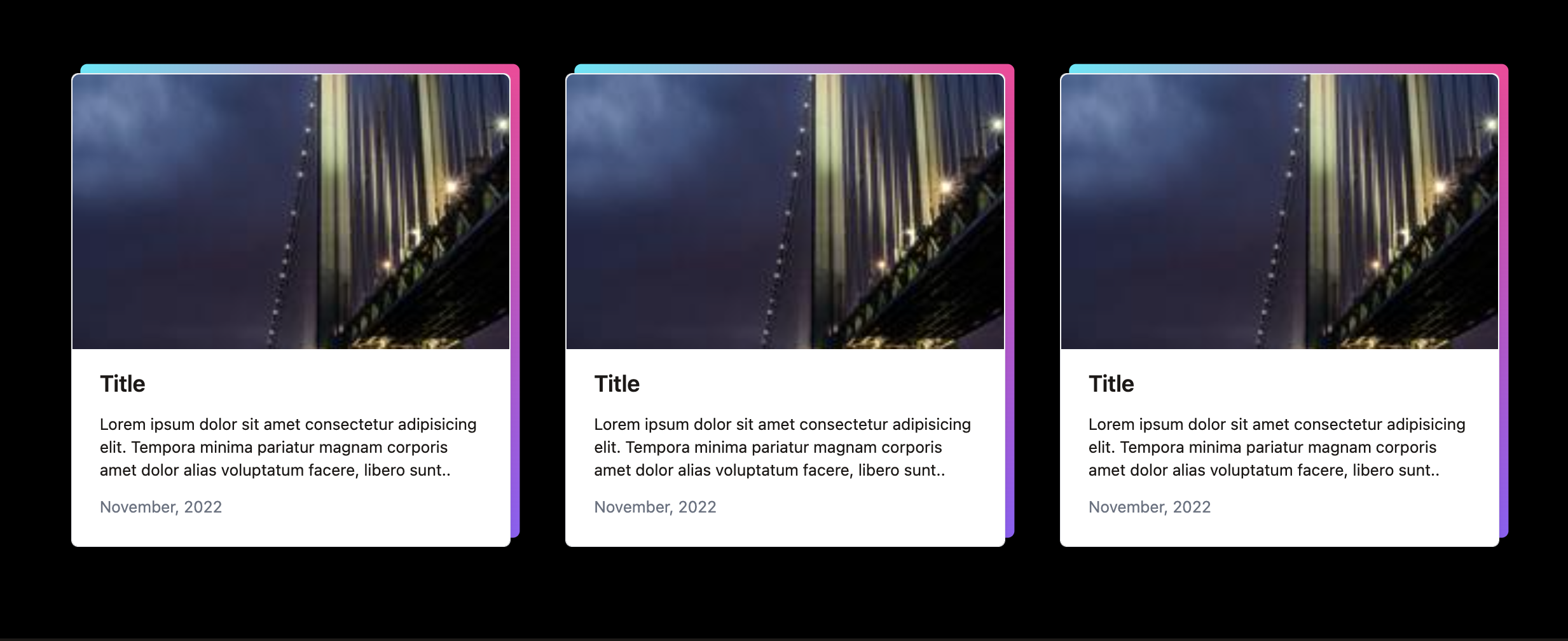
1<div class="max-w-7xl mx-auto my-20"> 2 <div class="grid grid-cols-3 gap-12"> 3 @foreach(range(1,3) as $post) 4 <div class="relative"> 5 <div class="flex flex-col h-full border rounded-md shadow-lg bg-white"> 6 <a href="#"> 7 <img src="https://picsum.photos/id/84/200/300" alt="" class="object-cover h-60 w-full rounded-t-md "> 8 </a> 9 <div class="flex-1 flex flex-col px-6 pt-4 pb-6">10 <a href="#" class="text-stone-900 flex-1">11 <div class="text-xl font-semibold mb-3 leading-snug">Title</div>12 <div class="line-clamp-3 text-sm">Lorem ipsum dolor sit amet consectetur adipisicing elit. Tempora minima pariatur magnam corporis amet dolor alias voluptatum facere, libero sunt..</div>13 </a>14 <div class="text-gray-500 text-sm mt-3">November, 2022</div>15 </div>16 </div>17 <div class="w-full h-full bg-gradient-to-br from-cyan-300 via-pink-500 to-violet-500 absolute inset-0 translate-x-2 -translate-y-2 rounded-md -z-10"></div>18 </div>19 @endforeach20 </div>21</div>we have a max-w-7xl element for our content with mx-auto to place it in the center of the page and some margin on top and bottom (my-20)
let’s make a grid with 3 columns and a gap between
1<div class="grid grid-cols-3 gap-12"></div>to make a card:
we need a div with flex, flex-col, and some styling () with first element image and 2nd div for all the text, which will also be flex flex-col for Title, Description and Date
1 @foreach(range(1,3) as $post) 2 <div class="flex flex-col h-full border rounded-md shadow-lg bg-white"> 3 <img src="https://picsum.photos/id/84/200/300" alt=""> 4 <div class="flex flex-col px-6 pt-4 pb-6"> 5 <div class="text-xl font-semibold mb-3 leading-snug">Title</div> 6 <div class="line-clamp-3 text-sm">Description.</div> 7 <div class="text-gray-500 text-sm mt-3">November, 2022</div> 8 </div> 9 </div>10@endforeachstyle the image: set the height of an image and object cover w-full, rounded top corners
1<img src="https://picsum.photos/id/84/200/300" alt="" class="object-cover h-60 w-full rounded-t-md ">apply flex-1 to Description div. This takes all the available space and pushes Date div to the bottom. h-full on parent div
now let’s make another card with bg gradient exactly the same as this card, but positioned behind this:
position absolute: this allows us to stack one element over the other
with properties top, right, bottom, left, inset-0 we can position this element exactly where we want it, based on relatively positioned element: (we need parent element relative, to know from where to apply top, left, bottom, right properties)
with z-index: we can set which element is over the other
1@foreach(range(1,3) as $post) 2 <div class="relative flex flex-col h-full border rounded-md shadow-lg bg-white"> 3 <img src="https://picsum.photos/id/84/200/300" alt="" class="object-cover h-60 w-full rounded-t-md "> 4 <div class="flex flex-col px-6 pt-4 pb-6"> 5 <div class="text-xl font-semibold mb-3 leading-snug">Title</div> 6 <div class="line-clamp-3 text-sm">Description.</div> 7 <div class="text-gray-500 text-sm mt-3">November, 2022</div> 8 </div> 9 </div>10 {{-- div with gradient positioned behind card--}}11 <div class="w-full h-full bg-gradient-to-br from-cyan-300 via-pink-500 to-violet-500 absolute inset-0 translate-x-2 -translate-y-2 rounded-md -z-10"></div>12@endforeach